

Completed (done as part of the Google UX Design Professional Certificate).
State
Goal
Improve personalization in pet food auto-delivery services.
Target Users
Busy, health-conscious pet owners
My Role
UX designer and researcher
Activities
Interview, empathy map, usability test, prototyping
Platform
Mobile (Android)
Tools
Figma, Miro, Zoom, Google Sheets


Industry
Petcare / Subscription services

Context & Problem Space
A pet food subscription app that uses AI to personalize delivery schedules and portion sizes based on each pet’s unique needs.
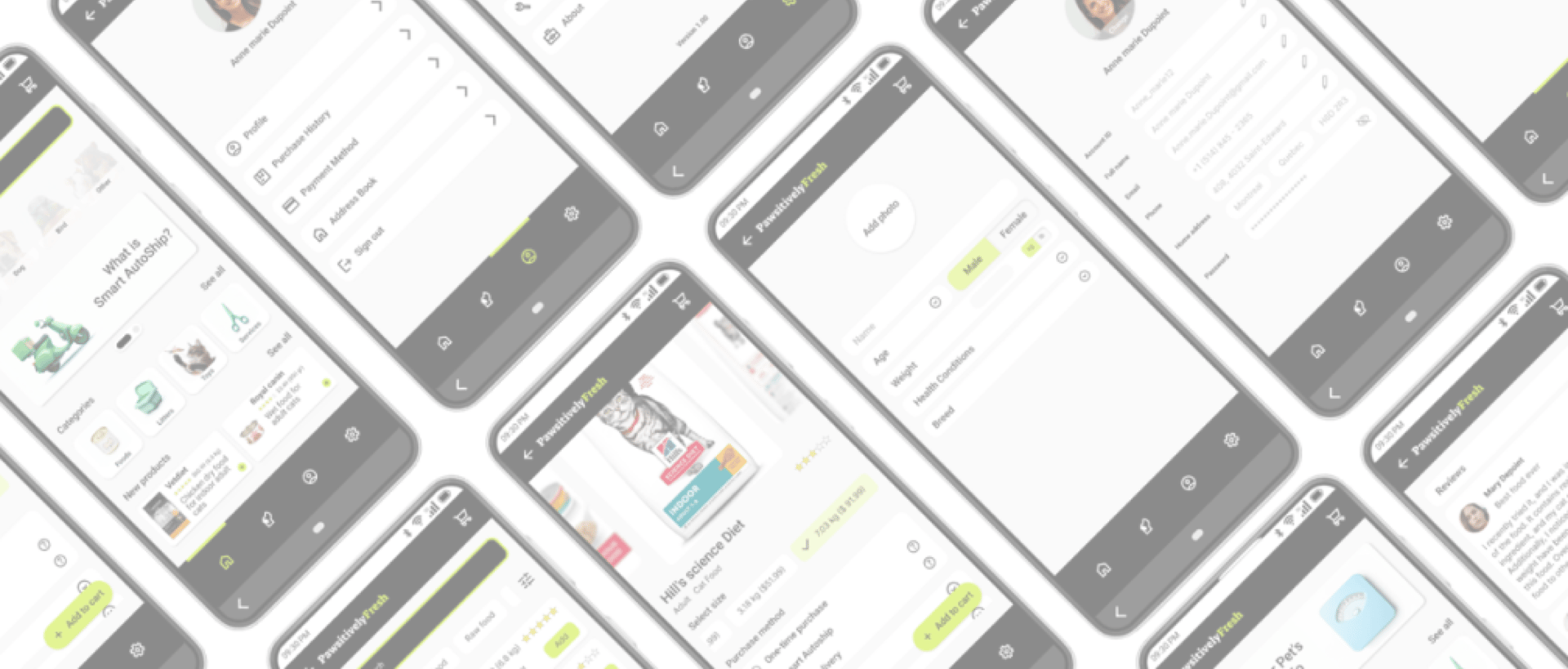
What is PawsitivelyFresh?
New and experienced pet owners alike often face uncertainty around how much and how often to feed their pets—especially when considering factors like age, weight, breed, and specific health conditions. Key pain points include:
What is the problem space?


Confusion about portion sizing


Lack of pet-level personalization


Inconsistent delivery timing
Most pet foods offer generic feeding tables that don’t account for individual pet profiles or medical needs, leaving owners unsure about the right amount to serve.
Multi-pet households often juggle different dietary needs, health issues, and feeding behaviors, but most platforms treat them as one-size-fits-all.
Without smart scheduling, users frequently experience overstocking or running out of food at critical times.
Research & Discovery
Since I couldn’t test directly with students, I partnered with the platform’s creator to play through the games and identify pain points from both educator and user perspectives. I used the following methods:
Heuristic evaluation of the original UI
Cognitive walkthroughs of key flows (sign-up, setup, gameplay)
Task flow mapping to clarify user goals
The results of the previously mentioned methods revealed the following key issues:
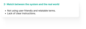
Unclear Objectives and Rules – Game goals and stage distinctions required verbal explanation from instructors.
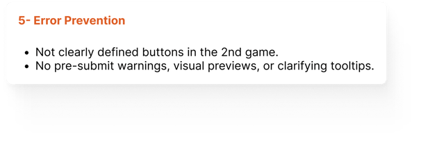
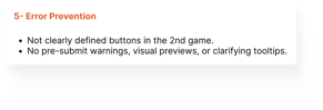
Inconsistent and Unclear CTAs – Buttons like “Submit” and “I Am Ready” varied in style and placement, leading to confusion.
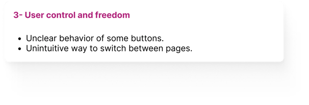
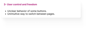
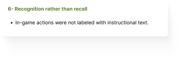
Lack of Feedback and Engagement Cues – The visual design offered minimal feedback or emotional engagement during gameplay.
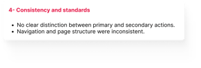
Scattered and Ambiguous Information – Game state, progress, and labels were disorganized or misleading.
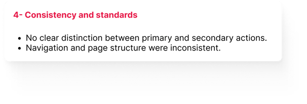
Insufficient Accessibility Considerations – Font size, contrast, and focus indicators did not meet accessibility standards.
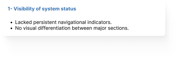
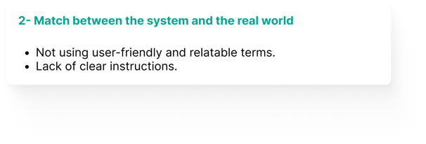
The heuristic evaluation and cognitive walkthrough revealed that the initial design exhibited at least one usability issue for each of Nielsen’s 10 heuristics, underscoring the need for a comprehensive redesign to enhance clarity, control, consistency, and overall user support
The task flow analysis uncovered key usability gaps—such as unclear progress indicators, vague feedback, and missed instructional cues—that disrupted the player experience.

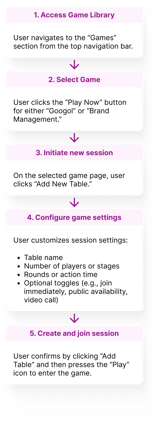
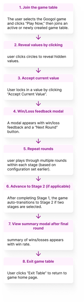
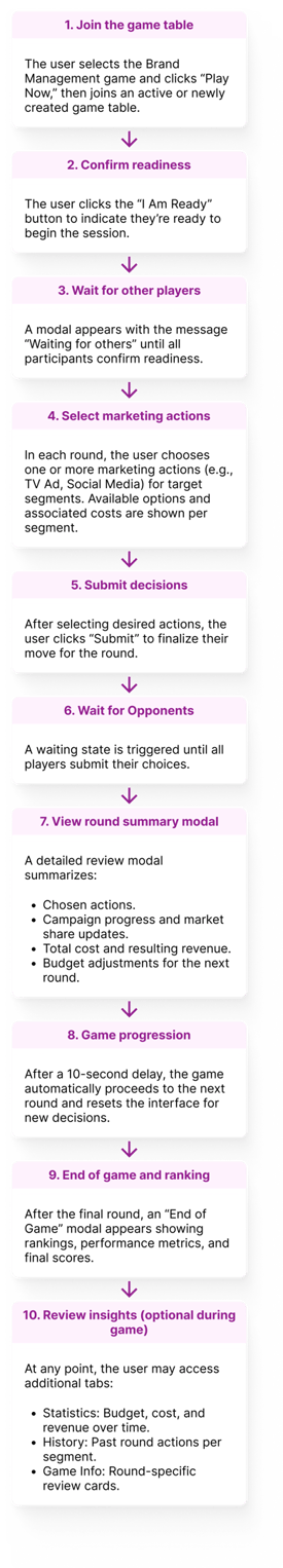
1- Heuristic Evaluation & Cognitive Walk Through
2- Task Flow Analysis


Main Findings:
To address these, I proposed targeted UX improvements—such as clearer progress indicators, intuitive terminology, visual feedback, simplified layouts, and just-in-time guidance—that enhanced clarity, reduced user effort, and increased engagement across the gameplay experience.
Design Process & Decisions
After identifying usability gaps through heuristic evaluation and task flow mapping, I rebuilt the user experience to make gameplay more intuitive, engaging, and scalable for future use in academic environments. My process followed an iterative, research-informed approach. I redesigned the platform in Figma, starting with a fresh but familiar structure:
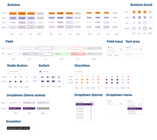
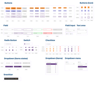
Built a scalable design system to future-proof the platform and streamline collaboration with developers and other designers. This system ensured consistency across the UI while supporting the addition of new features and games.
Tokens & Variables: Established foundational values for color, spacing, and typography to simplify global updates and improve maintainability.
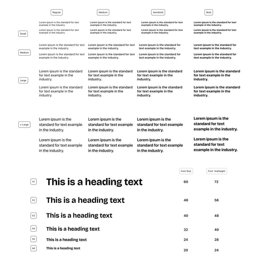
Typography & Spacing System: Defined a clear visual hierarchy to improve readability and ensure accessible, responsive layouts.
Reusable Component Library: Created flexible components for cards, buttons, forms, and dialogs—reducing redundancy and speeding up design and development cycles.
Developer Handoff Optimization: Used Figma’s variable collections and documentation to make developer collaboration smoother and more efficient.
Split the platform into public and logged-in views because public pages (e.g., About, Pricing, FAQs) can serve marketing goals, while logged-in pages evolve as the game or platform grows in features.

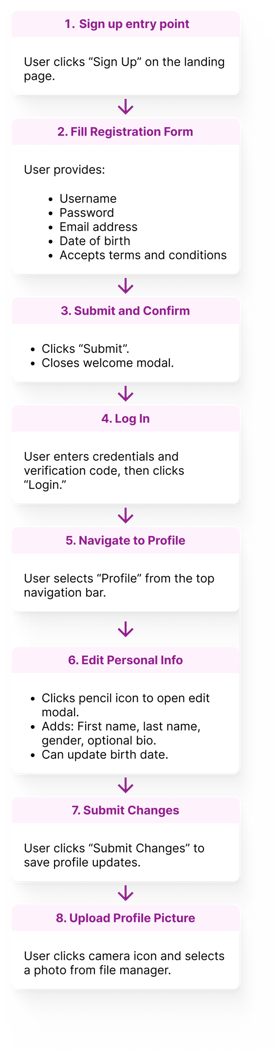
Simplified onboarding using more sign-in options (e.g., Google, Apple), clearer feedback, and progressive disclosure to ensure smoother user entry and profile completion—removing redundant steps from the original task flow.
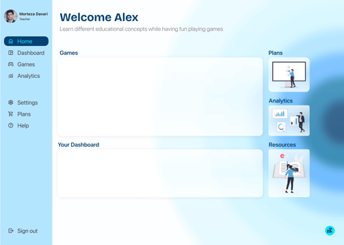
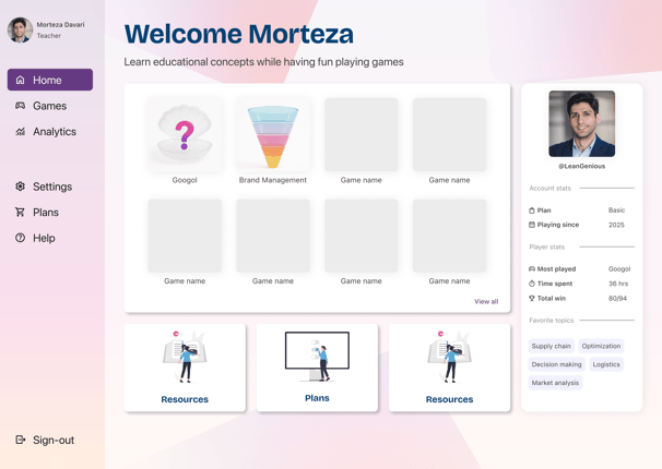
Created a dashboard for each user that gives them a central hub to manage their games, track learning progress, and access key resources and analytics. This not only reduced navigation friction and supported deeper engagement but also ensured scalability as the platform evolves with more games and features.
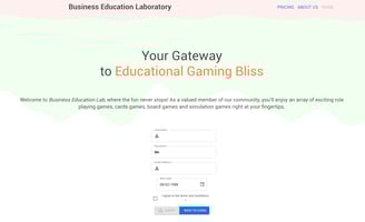

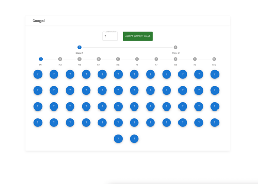
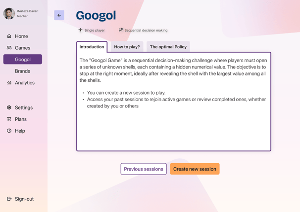
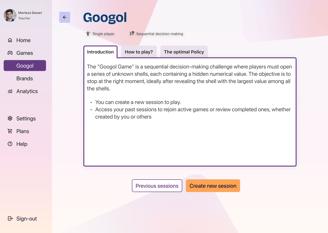
Original Design
1st version of the new design

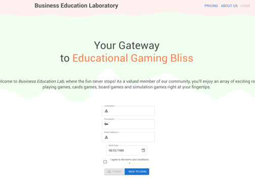
Original Design
1st version of the new design
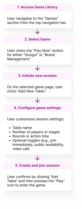
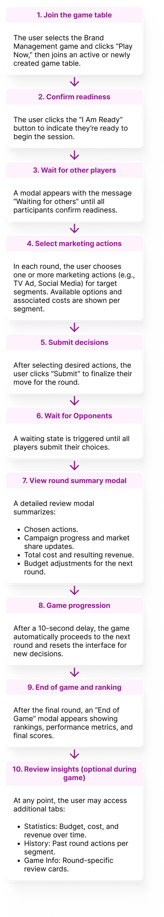
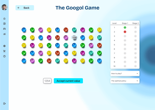
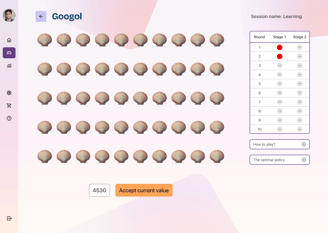
Redesigned both games to emphasize goals, instructions, progress, and real-time outcomes—reducing confusion and empowering users to make more confident decisions throughout gameplay.
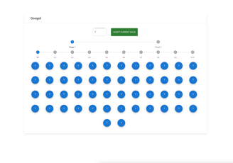

Original Design
1st version of the new design
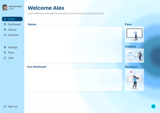
Introduced sidebar navigation and layout grids for structure and consistency
Design System

Iteration & Feedback
Throughout the design process, I regularly shared updates and prototypes with the project lead and received indirect feedback from other educators involved. Based on these sessions, I made key adjustments to:
Improve visual hierarchy.
Add clearer instructional elements.
The original blue palette was replaced with warm tones (purple, orange, soft pink) to create a more inviting, playful, and educational feel—moving away from a cold, corporate look.
I also asked a fellow UX designer to review the design — and their feedback confirmed that the revised platform felt more intuitive, organized, and classroom-ready.
Final Design


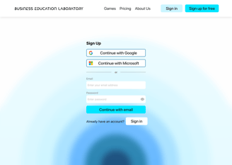
Landing page
Sign-up page
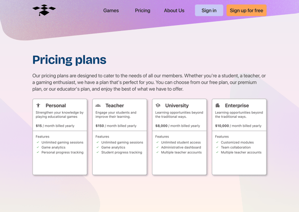
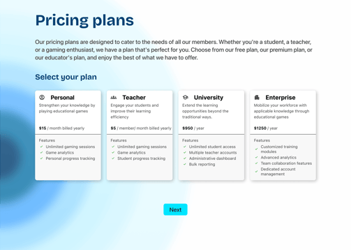
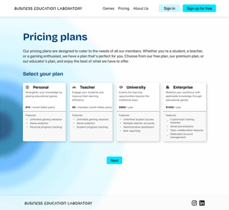
Pricing plans page
Home page

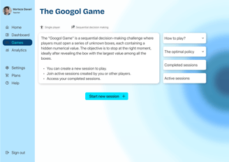
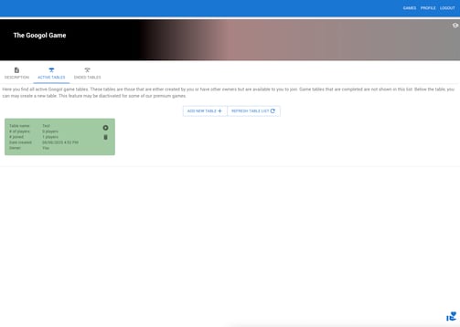
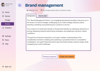
1st game home page
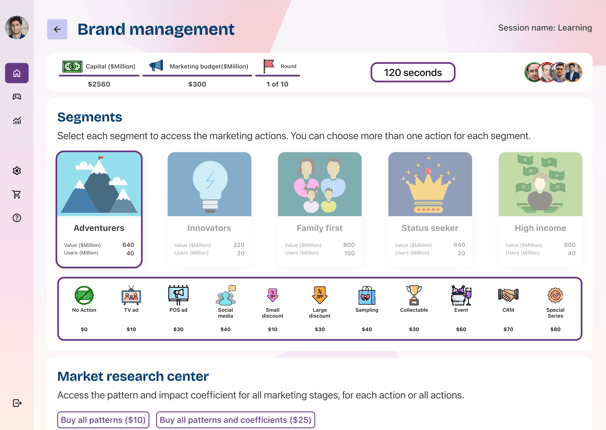
1st game play page

2nd game home page
2nd game play page
Outcomes & Learnings
Although the new version has not yet launched in classrooms, the redesign has already made a meaningful impact:
This project reinforced how much value a clear design system and scalable structure bring — not just for UX quality, but also for team momentum and developer alignment.


Educators felt the redesign was significantly clearer, more engaging, and more “professional”.
Stakeholder Feedback
Team Confidence
Boosted confidence in the platform’s potential to generate revenue through academic subscriptions and future B2B sales to universities and companies.
Peer Validation
UX peer review validated improvements in visual clarity, interaction design, and overall task flow efficiency.


Personal Growth
Strengthened my skills in building scalable design systems, applying tokenization best practices, and preparing dev-friendly handoffs for smoother implementation.